You are using an out of date browser. It may not display this or other websites correctly.
You should upgrade or use an alternative browser.
You should upgrade or use an alternative browser.
All Shirtsandlogos Teams Post Here!!!
- Thread starter akabigdaddy13
- Start date
Our Unis
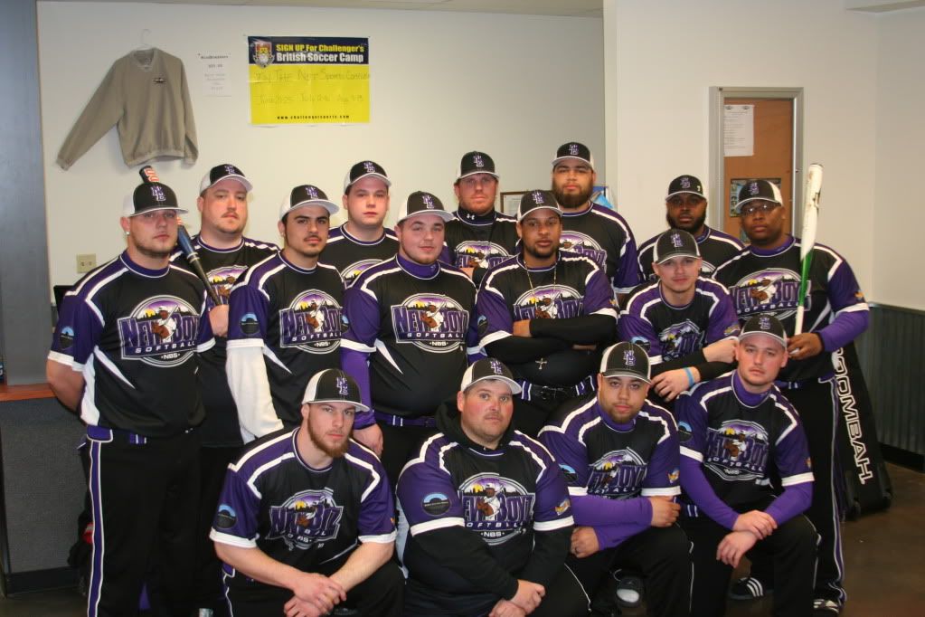
Here our unis for the upcoming season. A couple of more tweaks here and there, and then they will be set. Right now, I know the hat design will change, prob to a "TO". I've seen a mock-up of it, and they look really good. It has the same color combination and font as the "T" and the "O" in our logo.

Here our unis for the upcoming season. A couple of more tweaks here and there, and then they will be set. Right now, I know the hat design will change, prob to a "TO". I've seen a mock-up of it, and they look really good. It has the same color combination and font as the "T" and the "O" in our logo.
O-Prime
UH OH
Here our unis for the upcoming season. A couple of more tweaks here and there, and then they will be set. Right now, I know the hat design will change, prob to a "TO". I've seen a mock-up of it, and they look really good. It has the same color combination and font as the "T" and the "O" in our logo.

These are hella nice, great work S&L
WiscBdevils06
Addicted to Softballfans
Whats a piehouse fan have to do to get himself a hat? those are sharp!
JP6
PiehouseSix.com is here.
Whats a piehouse fan have to do to get himself a hat? those are sharp!
LOL, thanks....
Ask nicely...hahaha.
WiscBdevils06
Addicted to Softballfans
LOL, thanks....
Ask nicely...hahaha.
ill trade you a piehouse hat for a KA hat
The_Natural
Weak Glove
Here our unis for the upcoming season. A couple of more tweaks here and there, and then they will be set. Right now, I know the hat design will change, prob to a "TO". I've seen a mock-up of it, and they look really good. It has the same color combination and font as the "T" and the "O" in our logo.

You should keep the moose on the hat it looks sweet.
You should keep the moose on the hat it looks sweet.
Yeah i does look pretty sweet, but the problem is that Richardson (the hat company) said the moose needs to be simplified. Since I don't know the inter-workings of how hats are made, I can only assume the quality won't be that good if a simplified moose is put on there. So, that is why we prob will go with a "TO" but I hope we should see a mock-up before the order is finalized.
JP6
PiehouseSix.com is here.
ill trade you a piehouse hat for a KA hat
deal....... I'll email ya.
WiscBdevils06
Addicted to Softballfans
AJ22
Super Moderator
Here our unis for the upcoming season. A couple of more tweaks here and there, and then they will be set. Right now, I know the hat design will change, prob to a "TO". I've seen a mock-up of it, and they look really good. It has the same color combination and font as the "T" and the "O" in our logo.

SIR BUK's mock-ups ....

Final shirts and pants in less than 9 days ...


Overall, RON at GRAHAMS SPORTS APPAREL returned calls, was very customer friendly, and got our team EXACTLY what we wanted in a timely professional matter. WE WILL BE IN TOUCH for our next order. Thank you again to RON GRAHAM !!
Love the originality right there ... very sharp looking.
..
SevenBizzos
The R
Love the originality right there ... very sharp looking.
..
Of the 1000's of teams vs. the 1000's of color combinations, that was inevitable.
For the record, I didn't vote for that mockup.
JP6
PiehouseSix.com is here.
Timeout... I think it would look better if you don't fade the names or the numbers..... and if you do, just fade one or the other.
Yeah thanks, as of now, if we do have names on the backs they won't be faded. Those spots might be going to a sponsor so we might not have that issue. But thanks for the suggestion.
Sburgy4
Addicted to Softballfans
It was returned...
bags tourney, I win I get a hat, you win I get a hat. deal
akabigdaddy13
RAY,what did you do Ray?
this years full dye for tourneys......
akabigdaddy13
RAY,what did you do Ray?
.................................
Last edited:
akabigdaddy13
RAY,what did you do Ray?
this is the one i am going with this year....
Last edited:
Maximus Decimus
Slap Hands!
Just got these today

and this one


and this one

Lokii
Addicted to Softballfans
Here our unis for the upcoming season. A couple of more tweaks here and there, and then they will be set. Right now, I know the hat design will change, prob to a "TO". I've seen a mock-up of it, and they look really good. It has the same color combination and font as the "T" and the "O" in our logo.

Looks good,like the colours.....i reconize that logo its the Manitoba Moose AHL hockey team logo
Last edited:
shortstop5
T2W #5
damn, where are those fields?


