USMC_Staps
Addicted to Softballfans
Last edited:
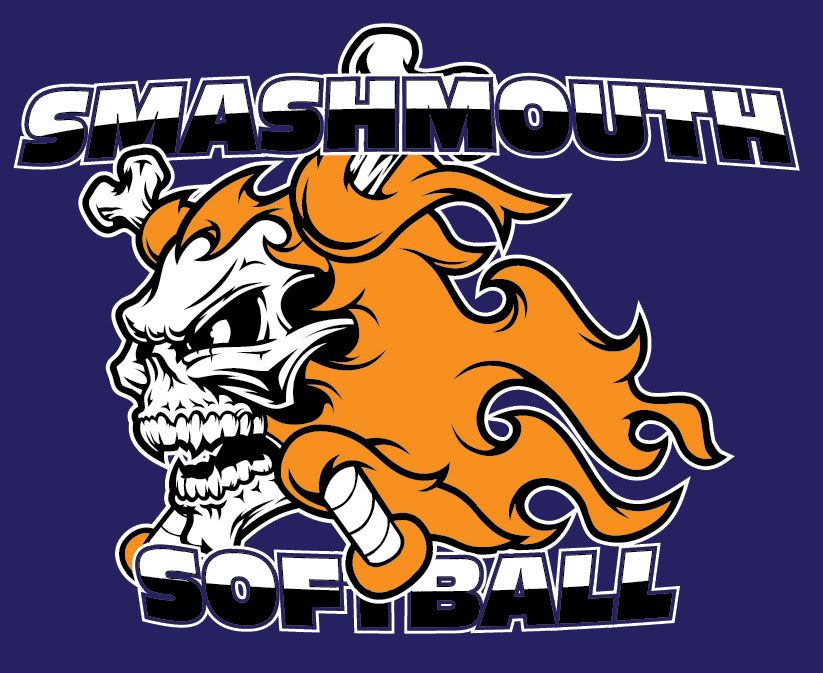
It may just be me, but the bat knob looks off-alignment from the bone in the alternate corner. Maybe if the bat knob was drawn at a different perspective the logo would be more effective. I don't know. Is it a bat or a bone?
The skull and flames are designed well, if that's your flavor.
The font on top could be arched on the bottom with the top letter alignment kept straight. By doing so, you may be able to show more 'depth' to the font, making it easier to read. Also, the black/white split isn't quite right. Perhaps keep the split where it is and make the black fill a gradient that fades from black to white, top to bottom. Hope that makes sense. I wish I was at work to show you what I'm thinking.

When I hear "Smashmouth" I think more of a screaming baseball than a skull with flames. Just my opinion.

u mean something more like this...
screen print
u mean something more like this...

Yes we are playing in the ISA states this weekend, but I am not. I am not a fan of ISA here so I wont play in their tournaments. I love all the feedback that I have received so far. I also really dont dig the logo design, like the other guy said it doesnt match the name. I do not know what else to come up with but we have to have these jerseys by next weekend so really do not have much of a choice. Adam I would ask you to rework this but unless Ray at Evolution Sports has some kind of Transport machine I just do not see us getting them in time if any work is done. I may be mistaken but I just dont see it. Again thanks for all the feedback and hope to get more. Thanks all and good luck where ever your play!!
Close, but the yellow just isn't all that intimidating.
are you color blind noob,.,,, OG Smashmouth colors are orange and blue
Then that makes it even worse...the background color is very weak if it's suppossed to be orange.
Are you playing the tourney at the CG base next week?
Close, but the yellow just isn't all that intimidating.

that was just the logo...here's the jersey.