You are using an out of date browser. It may not display this or other websites correctly.
You should upgrade or use an alternative browser.
You should upgrade or use an alternative browser.
Awesome Job on 2013 uni's
- Thread starter Scan2Be
- Start date
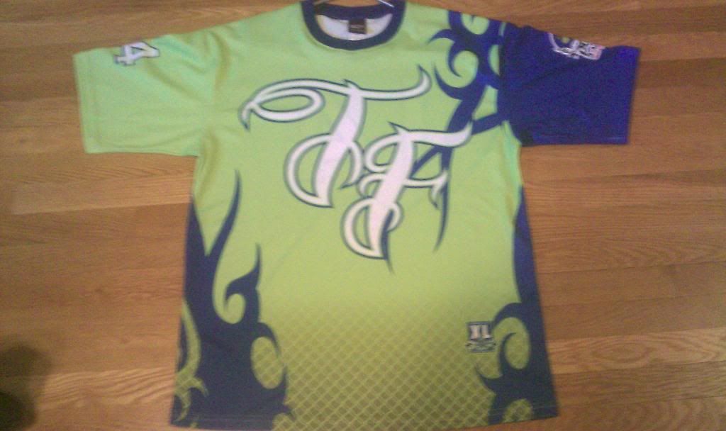
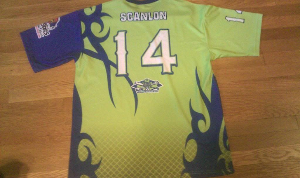
oakleydude44
Geaux Time!
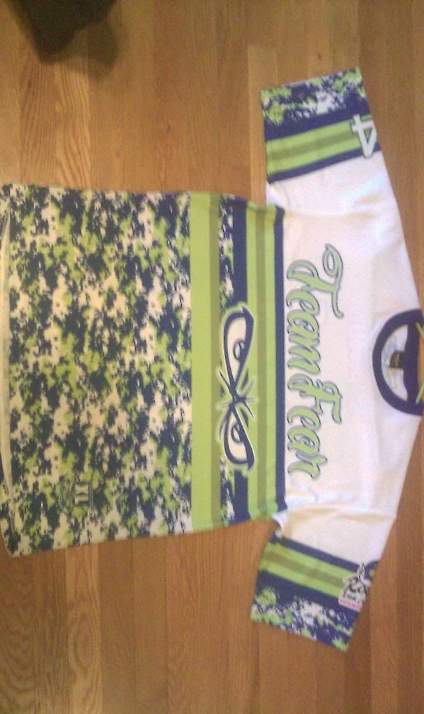
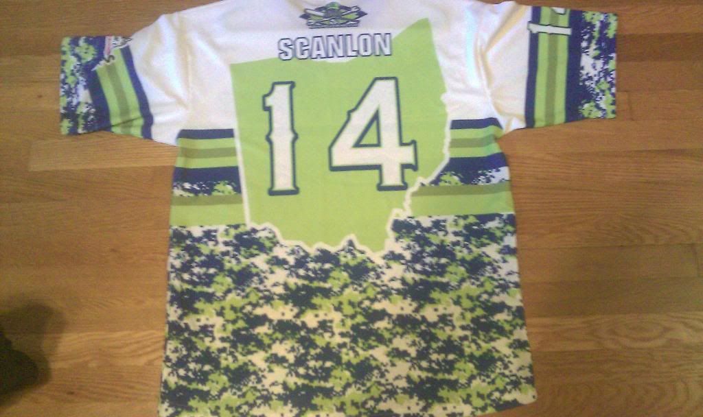
Like the second shirt better. Is Ohio supposed to be off center?
It's centered. It just looks off because it's tilted.
wagon487
2016 Vegas Champs 60 Major
It's centered. It just looks off because it's tilted.
you know what I meant
")