You are using an out of date browser. It may not display this or other websites correctly.
You should upgrade or use an alternative browser.
You should upgrade or use an alternative browser.
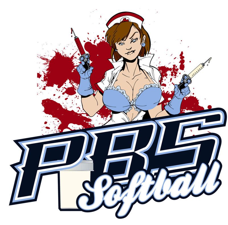
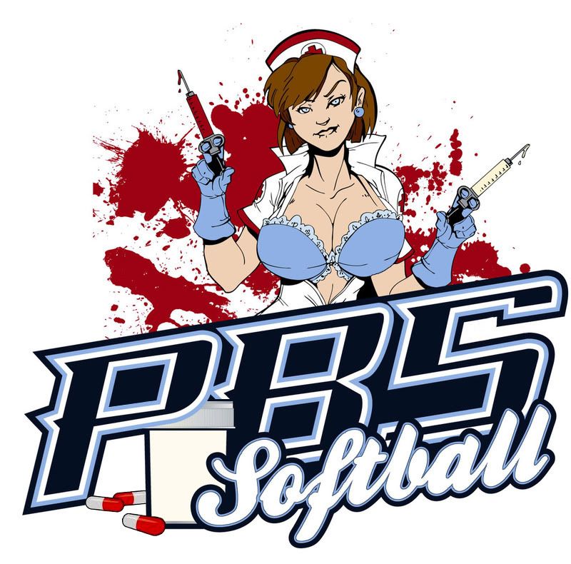
Logo for local team
- Thread starter dds109
- Start date
toad_2
Semiretired Player
I would watch out for random specs of color that distract from the overall image of the logo, i.e. the stray blood splatter marks by the 'S', the bottle peaking out from behind the opening of the 'P' & the spaces behind the word 'Softball'. Other things to be aware of with vector graphics & keeping the image consistant are the outlines around shapes & objects, i.e. the ouline under the breast & sleave of the nurse and also the bottle cap. Also, try adding a dark blue inline on the word 'Softball' to separate the white & the light blue outline. Any time light blue gets used as an outline around a white object it makes the object a little blurry to the eye, especially if a darker outline is used around the entire image.
Another observation that I have is....what does the bottle represent? Is it a medicine bottle or a specimen bottle? Just having the bottle & it's placement makes for an awkward space beneath the verticle arm of the 'P'. Maybe adding a few pills or some specimen sample spilling over may help strengthen that portion of the design.
Overall, you've made good use of negative space & image layering. Good work.
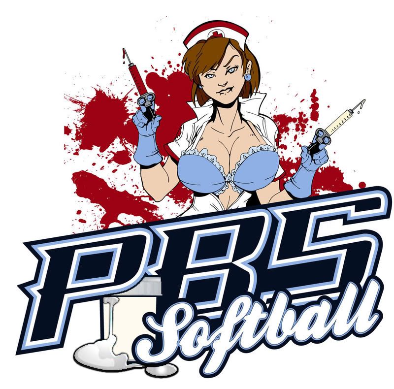