Better looking Logo, now?

pjordan4477

Hashtag a hashtag
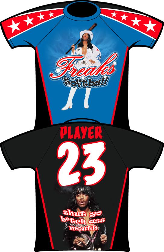
I was bashed for this logo when it looked like this:
Front_Logo.jpg

On a plain blue dri-fit.

But now it looks like this:
FreaksTribal.jpg


freaks-jersey.jpg


Better?
 
Last edited:

s2ntburd

Addicted to Softballfans
its got tribal in the backround, and the word softball is moved up.
 
Last edited:

bradblah

Weeeeee
that jersey has almost every overused thing in jerseys all rolled into one. flames, skulls, diamond plate, & tribal.

not a big fan, but i'm not the one wearing it - rock it if that's what you like.
 

Stretch19

Grow up
honestly the OG logo on a plain blue shirt would look better than what this has evolved into...the flames look pretty whack, the tribal is super lame, diamond plates on the shoulders ehhhhhh, no and are those skulls on the side panels or gorillas?

either way, this is definitely not an upgrade in my opinion. im not from the old school and like super plain jerseys, but sometime less is more, cause what you got going on now certainly isnt working imo
 

Toad_1

I can't hit
He's alive. How ya been Toad_2?

He and I have yet to take bp in order to break in his new(er) bat.

As always Oak, keep up the great work.
________

And the artwork... Played out theme and outdated. But, if you're happy with what's presented, keep it and disregard the negative feedback.
 

pjordan4477

Hashtag a hashtag
honestly the OG logo on a plain blue shirt would look better than what this has evolved into...the flames look pretty whack, the tribal is super lame, diamond plates on the shoulders ehhhhhh, no and are those skulls on the side panels or gorillas?

either way, this is definitely not an upgrade in my opinion. im not from the old school and like super plain jerseys, but sometime less is more, cause what you got going on now certainly isnt working imo

I requested the diamond plate shoulders, digitized camo indur the arms and redesigned the logo itself. I wanted the blue front and black back, everything else was dealer design, and I approved it.


What are team using that's better? Personally, I think they are better than most I've seen in tourney ball in STL, MO.

And the subdye is a step up from the print on dri-fit previous version, fo sho.
 

pjordan4477

Hashtag a hashtag
anyone willing to post (image) what their opinoin of a better jersey is? What are the current trends that I'm missing. The Freak on Steriods isn't going away, but what would make this look better?
 
Top