Logo Critique Please

Toad_1

I can't hit
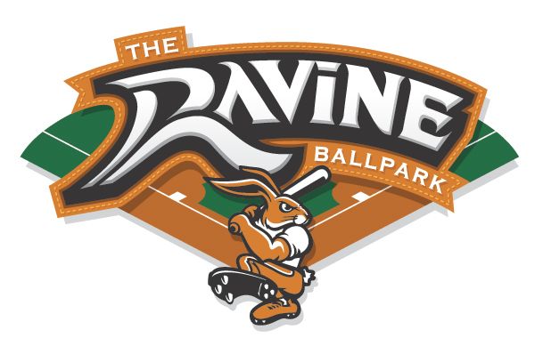
Please critique this logo with honesty, the more accurate the better. All you designers out there, now's your chance to show your know-how and expertise on the subject. (You know who you are.)

Background info:

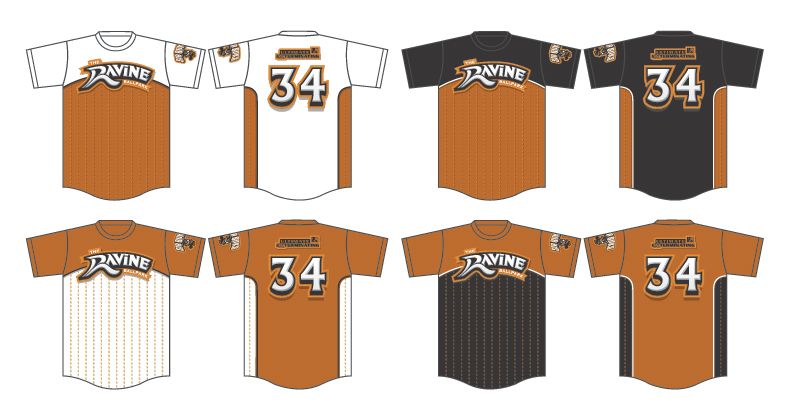
Create a logo for a local ballpark and it's affiliated softball team.
Colors: Texas Orange / Black / White

Here are the concepts I've come up with, so far:
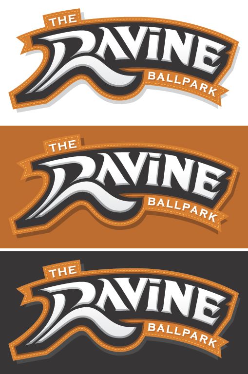
the_ravine_ballpark_field_logo2.jpg


the_ravine_ballpark_logotype3.jpg


the_ravine_ballpark_buks_logo.jpg
 

toad_2

Semiretired Player
Bro, I like the revisions. Are the logos that high on the chest because they want to show off their beer bellies:eek:;) JK
From the small mock-ups it looks like the logos are a little high but not bad. I have to pick on something. Loving the color combination, btw. Can't wait to see the final product. Keep us updated.

AJ22, you are going to look great on the field with those. You're getting your $$$ worth:eek: Just don't go to Sp*rts55 for printing, LMFAO...unless you get a deal from ego WITH a guaranteed shipping in writing or everything is free. :rolleyes:
 

Pinstripe Pride

Addicted to Softballfans
I think all of these are amazing. But I am not a fain of the dotted line pattern on the shirt or the half color split on the front of the shirt. The back of the shirts look cool. The first graphic of the field logo with the green field in the back is great! Numbers are solid as well.
 

Mikaka

My Dixie Wrecked
the UEX logos need some white to make it pop a little bit more, don't quite get the stitching idea. must be nice to have a team that has it's own ballpark. those jerseys are pretty slick. i've told ya before toad_1, you're pretty damn good at this here game
 

Unleashed_19

Outstanding Bad Dealer
They look good, but I personally do not like the way the R looks, doesn't "flow" with the rest of the lettering, if that makes any sense.
 

Toad_1

I can't hit
They look good, but I personally do not like the way the R looks, doesn't "flow" with the rest of the lettering, if that makes any sense.

Makes perfect sense to me. I was given the 'R' logo to use, the rest is mine.

Here's what I was provided with: (created by another designer)

Page1of1.jpg
 

aulee42

In the ice shanty
I really want to see this logo because ben you do some great work. If it all matters i can see this R lol!

Makes perfect sense to me. I was given the 'R' logo to use, the rest is mine.

Here's what I was provided with: (created by another designer)

Page1of1.jpg
 

Mikaka

My Dixie Wrecked
You might have to figure out how to repost them for me, since it's quite obvious I fail. :rolleyes: (Damn the red X's, they get me every time.)

they're photobucket images. i can't do any better than what you have already
 
Top