You are using an out of date browser. It may not display this or other websites correctly.
You should upgrade or use an alternative browser.
You should upgrade or use an alternative browser.
Our Elite Mock-ups
- Thread starter codeman15
- Start date
BallewTheBear
Addicted to Softballfans
nixonride1
SEA -HAWKS
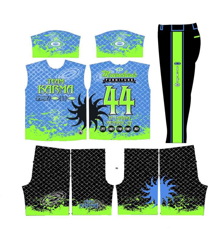
Colors are great...there is a lot going on there...but it will probably be less distracting once they are actually printed...I would probably loose the barbwire chain link
AllFlashNoBash
Addicted to Softballfans
Nope. Try again please.
Chain link, paint splatter, saw blade... Simmer down now.
Chain link, paint splatter, saw blade... Simmer down now.
RodeoClown
ACCOUNT DELETED
get rid of the saw blade
RDSPURLOCK1
BERZERKER
wow code, you dig those green colors dont ya bro lol good luck this year i'll definately see ya lol
roland365
GDC SILVER STATUS MEMBER
These are prettymuch making me sick!
Fixed it for u
toad_2
Semiretired Player
I would say get rid of the gradients in the blades & the 'in memory of' circles. Also, simplify the blades so that they are more of a graphic element and not just decoration; two layers of blades is too much. Definitely get rid of the paintbrush element that is ghosted over the top of the fencing, you already have the paint splatter at the bottom of the design depicting a 'grunge' or 'distressed' look. Less is always more.
codeman15
Addicted to Softballfans
UNIFORMS have arrived today and I would like to say thanks too ELITE and JOSE cause they did a great job!!!
ckick on this...... http://s1095.photobucket.com/albums/i470/CThacker15/
ckick on this...... http://s1095.photobucket.com/albums/i470/CThacker15/
chief1B
Addicted to Softballfans
UNIFORMS have arrived today and I would like to say thanks too ELITE and JOSE cause they did a great job!!!
ckick on this...... http://s1095.photobucket.com/albums/i470/CThacker15/
do you have the worlds smallest camera to take those little tiny pictures?
oakleydude44
Geaux Time!
Here you go bro!


Those pics need to be bigger. IJS