You are using an out of date browser. It may not display this or other websites correctly.
You should upgrade or use an alternative browser.
You should upgrade or use an alternative browser.
Streakers Softball Logo - Please Critique
- Thread starter toad_2
- Start date

1stbasefunky
Addicted to Softballfans
Something very wrong about this!
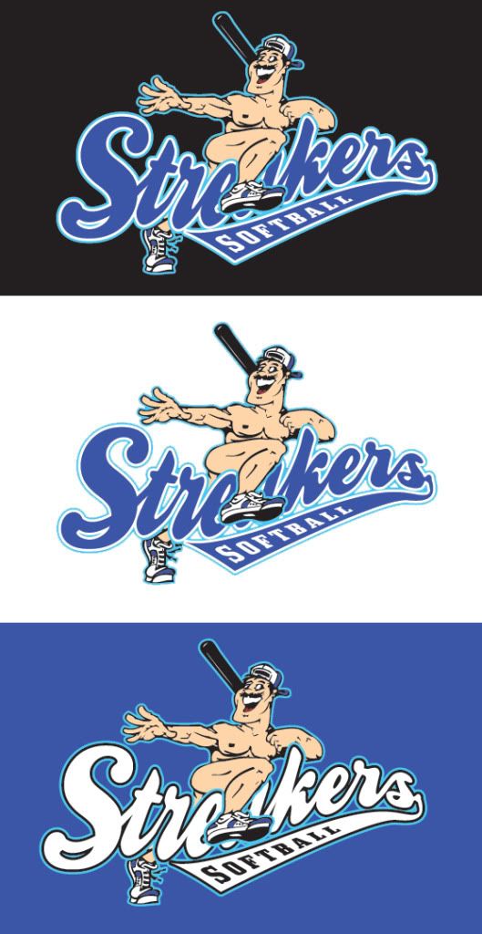
Is his junk in the 'a'-hole?
lamo...
only thing i see is the chest, make it more square looking not round, look like the dude has bi tch t i t s..
Unleashed_19
Outstanding Bad Dealer
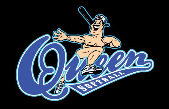
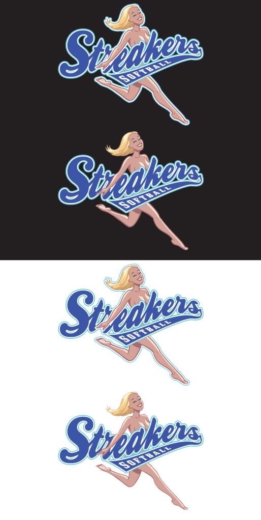
Why not have a chick streaker? Wouldn't look so gay...Dude looks like Freddy from Queen!
HooterHunter
Addicted to Softballfans
Freddy Mercury trolling softball fields for Fat Bottom dudes!!!
LMAO!!
LMAO!!
toad_2
Semiretired Player
"We were wanting like a guy running naked with a hand in the air holding a bat and the name streakers sort of covering him to be appropriate for on a jersey. We arent real sure on base colors but thinking maybe a blue color and black jersey"
I'm workin' on the Freddy tribute logo. Will post shortly.
I'm workin' on the Freddy tribute logo. Will post shortly.
toad_2
Semiretired Player
Is his junk in the 'a'-hole?
Someone was thinking
Now the secret is out Shhhhh, damn you bro.RokRaider826
Ex Softball Who-re
Why not have a chick streaker? Wouldn't look so gay...Dude looks like Freddy from Queen!
What he said, Dude looks to "Happy",
toad_2
Semiretired Player
Why not have a chick streaker? Wouldn't look so gay...Dude looks like Freddy from Queen!
Pinstripe Pride
Addicted to Softballfans
I agree. get a good lookin lady on there. Unless this is for a gay league. In which case, it's perfect.
bamaboy1626
You need my opinion!!!
loooks kinda gay if you ask me
oakleydude44
Geaux Time!
You should add a security guard with a taser gun running behind the streaker. Looks good, design wise.
RColeman23
Addicted to Softballfans
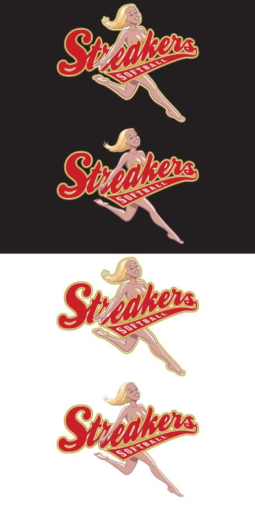
nice. put her arm up so you can see the whole name. Bigger cans would be nice too.
OG_\FlyingPigs
Purrrrrr
Have the bat coming out of the bottom side of streakers softball.
BaySickClothing
The Veteran
The chick ftw, I'd rock it!
Pinstripe Pride
Addicted to Softballfans
Like the chick w/ the Red and gold writing.
Hebrew Hacker
Derby Jew
If you've got a big enough pair and can say **** it all, the one with the guy is great. Kind of like the argyle jerseys.
Pinstripe Pride
Addicted to Softballfans
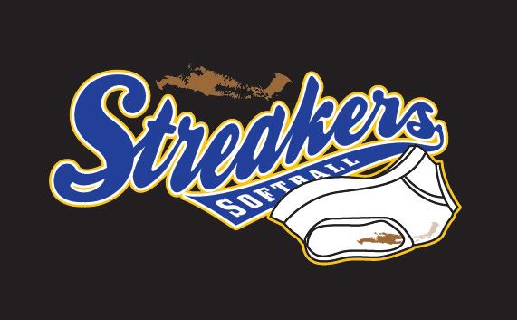
No to the underpants .... I think the streakers logo going over a fake naked hairy chest shirt would be f-ing hilarious. NEED TO SEE THAT MOCKED UP ASAP!